


Decorating a space, whether it's a cozy living room, a vibrant office, or a dreamy bedroom, is all about creating a harmonious and inviting atmosphere. One of the key elements in achieving this is the careful selection and matching of fabric colors. As a fabric decoration supplier, I've seen firsthand how the right color combinations can transform a room from ordinary to extraordinary. In this blog post, I'll share some tips and tricks on how to match fabric colors in decoration like a pro.
Understanding Color Theory
Before diving into the world of fabric color matching, it's essential to have a basic understanding of color theory. Colors can be divided into three primary categories: primary, secondary, and tertiary. Primary colors are red, blue, and yellow, and all other colors can be created by mixing these three. Secondary colors are orange, green, and purple, which are made by mixing two primary colors. Tertiary colors are created by mixing a primary and a secondary color.
There are also different color schemes that you can use to create a cohesive look in your space. Some popular color schemes include:
- Monochromatic: This scheme uses different shades and tints of the same color. It creates a sophisticated and calming look.
- Analogous: This scheme uses colors that are adjacent to each other on the color wheel. It creates a harmonious and natural look.
- Complementary: This scheme uses colors that are opposite each other on the color wheel. It creates a bold and dynamic look.
- Split Complementary: This scheme uses a color and the two colors adjacent to its complement. It creates a balanced and interesting look.
Choosing the Right Color Palette
Once you have a basic understanding of color theory, it's time to choose the right color palette for your space. Here are some tips to help you get started:
- Consider the mood: Think about the mood you want to create in the room. Do you want it to be calm and relaxing, or energetic and vibrant? Different colors can evoke different emotions, so choose a palette that aligns with the mood you're going for.
- Look at the existing elements: Take a look at the existing elements in the room, such as the walls, furniture, and flooring. Choose a color palette that complements these elements and creates a cohesive look.
- Think about the season: Consider the season when choosing your color palette. For example, bright and bold colors are great for summer, while warm and earthy colors are perfect for fall.
- Use a color wheel: A color wheel can be a helpful tool when choosing a color palette. It can help you identify complementary and analogous colors and create a balanced and harmonious look.
Matching Fabric Colors
Now that you've chosen the right color palette for your space, it's time to start matching fabric colors. Here are some tips to help you create a cohesive and stylish look:
- Start with the dominant color: Choose a dominant color for the room and use it as the foundation for your color scheme. This could be the color of the walls, the furniture, or a large piece of artwork.
- Add accent colors: Once you have your dominant color, add some accent colors to bring the room to life. Accent colors can be used in small doses, such as in throw pillows, curtains, or rugs.
- Mix textures: Mixing different textures can add depth and interest to your space. For example, you could pair a smooth silk fabric with a rough woolen blanket to create a contrast.
- Use patterns: Patterns can be a great way to add visual interest to your space. However, it's important to choose patterns that complement each other and the overall color scheme of the room.
Examples of Color Combinations
Here are some examples of color combinations that work well in different types of spaces:
- Living room: For a cozy and inviting living room, you could choose a monochromatic color scheme in shades of beige and cream. Add some accent colors in bold hues, such as red or orange, to create a pop of color.
- Bedroom: For a relaxing and peaceful bedroom, you could choose an analogous color scheme in shades of blue and green. Add some soft, neutral colors, such as white or gray, to create a calming atmosphere.
- Kitchen: For a bright and cheerful kitchen, you could choose a complementary color scheme in shades of yellow and purple. Add some white or silver accents to create a clean and modern look.
- Office: For a productive and focused office, you could choose a split complementary color scheme in shades of blue, yellow, and orange. Add some black or brown accents to create a professional and sophisticated look.
Incorporating Seasonal Decor
In addition to choosing the right color palette for your space, you can also incorporate seasonal decor to add a touch of holiday spirit. Here are some examples of seasonal decor that you can use:

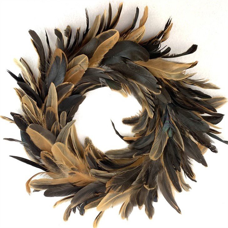
- Christmas: For Christmas, you could add some festive decor, such as a Chicken Feather Wreath or a Christmas Tree Music Box. Choose colors like red, green, and gold to create a traditional Christmas look.
- Easter: For Easter, you could add some cute and colorful decor, such as Easter Wooden Bunny Tabletop Ornaments. Choose colors like pastel pink, yellow, and blue to create a spring-like atmosphere.
Conclusion
Matching fabric colors in decoration is all about creating a harmonious and inviting atmosphere. By understanding color theory, choosing the right color palette, and mixing and matching different fabrics and textures, you can create a space that reflects your personal style and makes you feel comfortable and happy. If you're looking for high-quality fabric decorations at affordable prices, look no further than our company. We offer a wide range of fabric products, including curtains, pillows, and throws, in a variety of colors and patterns. Contact us today to learn more about our products and to start planning your next decorating project!
References
- "Color Theory Basics: A Beginner's Guide." Canva, 2021.
- "How to Choose the Right Color Scheme for Your Home." HGTV, 2021.
- "The Psychology of Color in Interior Design." Real Simple, 2021.